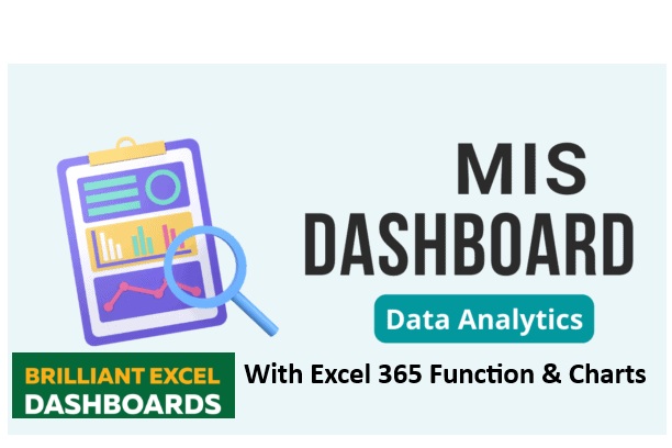
Microsoft Excel Data Analysis and Dashboard Reporting
This expert-level course focuses on Microsoft Excel Data Analysis and Dashboard Reporting, providing comprehensive training on various aspects of dashboard creation and automation. It covers Pivot Tables, allowing users to summarize data efficiently, integrate external sources, use Power Pivot and SQL, and apply slicers for better visualization. Additionally, the course dives into advanced formulas for logical operations, data summarization, and dashboard automation tricks. Learners will explore chart automation, including dynamic charts using offset formulas and interactive buttons. The course also teaches VBA macros, enabling users to create functions, handle events, and automate formatting and file management. Moreover, it emphasizes dashboard design techniques, such as color tricks, object linking, and structured formatting. Multiple live dashboard examples—including KPI dashboards, financial analysis, customer service reports, and sales performance tracking—help solidify practical skills. The training further extends to Power BI and Tableau, equipping users with the ability to connect data sources, use formulas, generate interactive visualizations, and create professional-grade dashboards.
 Instructor Name - Sujit Kumar Singh
About this Course
This expert-level Microsoft Excel Data Analysis and Dashboard Reporting course is designed to equip learners with advanced skills in data visualization, automation, and analytics. It covers a wide range of dashboard techniques, starting with Pivot Tables, where users learn to summarize large datasets, apply Power Pivot, integrate SQL, and utilize slicers for interactive reporting. Moving into formulas, the course explores logical expressions, data summarization techniques, array functions, and essential dashboard formulas to streamline workflows
Automation plays a significant role in dashboard efficiency, and this course dives into dynamic charts, the use of interactive buttons, and tricks for optimizing visualization. Learners gain hands-on experience through live projects, applying automation methods to real-world scenarios. A deep understanding of VBA macros is also included, enabling users to create custom functions, user forms, and handle file management tasks, making dashboards more responsive and interactive.
Beyond functionality, the course emphasizes design and formatting techniques—such as color schemes, object linking, picture embedding, border enhancements, and layout structuring—to ensure visually appealing and professional dashboards.
The curriculum provides practical examples, including KPI dashboards, financial analysis, customer service reports, and sales performance dashboards, tailored for various industries. Moreover, participants will expand their expertise with Power BI and Tableau, mastering data connectivity, formula applications, and developing interactive dashboards that leverage cutting-edge analytics tools.
Skills you'll gain
- Advanced Excel Proficiency - Data Formatting & Visualization - Formula Expertise Data Aggregation - Dashboard Automation - Industry-Specific Dashboard CreationSyllabus (Download PDF)
- Semantic HTML
- Semantic HTML
About the Instructor

MR. Sujit Kumar Singh
MIS & Data Analyst
4.87 Instructor rating
25K reviews
>1L Students
29 Live courses
In 2007, Sujit founded IPT Excel School, one of the pioneering institutes in New Delhi offering online live classes in Advanced Excel and MIS training. The institute caters to working professionals, providing courses that cover Advanced Excel, VBA Macros, Dashboard creation, and Power BI.
Sujit also maintains an active presence on platforms like YouTube and LinkedIn, where he shares tutorials and insights on Excel and related tools. His YouTube channel, Sujeet Kumar Advanced Excel Training in Hindi, offers a range of videos aimed at enhancing Excel proficiency.
For more information or to enroll in his courses, you can visit IPT Excel School's website or contact him directly at +91 8802579388.
3 Days Free DEMO Class
₹ 10,000/- (INR)(2.5k Group Class)
Duration
35.0 Hrs
Lectures
40
Batch Size
One or 12
Language
English / Hindi
Skill Level
Beginner to Expert
Mode
Online Live
Certificate
Yes